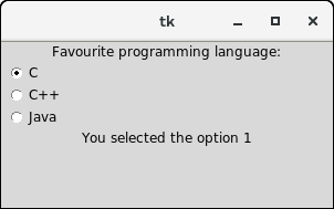
Python Tkinter RadiobuttonThe Radiobutton widget is used to implement one-of-many selection in the python application. It shows multiple choices to the user out of which, the user can select only one out of them. We can associate different methods with each of the radiobutton. We can display the multiple line text or images on the radiobuttons. To keep track the user's selection the radiobutton, it is associated with a single variable. Each button displays a single value for that particular variable. The syntax to use the Radiobutton is given below. Syntax
| SN | Option | Description |
|---|
| 1 | activebackground | The background color of the widget when it has the focus. | | 2 | activeforeground | The font color of the widget text when it has the focus. | | 3 | anchor | It represents the exact position of the text within the widget if the widget contains more space than the requirement of the text. The default value is CENTER. | | 4 | bg | The background color of the widget. | | 5 | bitmap | It is used to display the graphics on the widget. It can be set to any graphical or image object. | | 6 | borderwidth | It represents the size of the border. | | 7 | command | This option is set to the procedure which must be called every-time when the state of the radiobutton is changed. | | 8 | cursor | The mouse pointer is changed to the specified cursor type. It can be set to the arrow, dot, etc. | | 9 | font | It represents the font type of the widget text. | | 10 | fg | The normal foreground color of the widget text. | | 11 | height | The vertical dimension of the widget. It is specified as the number of lines (not pixel). | | 12 | highlightcolor | It represents the color of the focus highlight when the widget has the focus. | | 13 | highlightbackground | The color of the focus highlight when the widget is not having the focus. | | 14 | image | It can be set to an image object if we want to display an image on the radiobutton instead the text. | | 15 | justify | It represents the justification of the multi-line text. It can be set to CENTER(default), LEFT, or RIGHT. | | 16 | padx | The horizontal padding of the widget. | | 17 | pady | The vertical padding of the widget. | | 18 | relief | The type of the border. The default value is FLAT. | | 19 | selectcolor | The color of the radio button when it is selected. | | 20 | selectimage | The image to be displayed on the radiobutton when it is selected. | | 21 | state | It represents the state of the radio button. The default state of the Radiobutton is NORMAL. However, we can set this to DISABLED to make the radiobutton unresponsive. | | 22 | text | The text to be displayed on the radiobutton. | | 23 | textvariable | It is of String type that represents the text displayed by the widget. | | 24 | underline | The default value of this option is -1, however, we can set this option to the number of character which is to be underlined. | | 25 | value | The value of each radiobutton is assigned to the control variable when it is turned on by the user. | | 26 | variable | It is the control variable which is used to keep track of the user's choices. It is shared among all the radiobuttons. | | 27 | width | The horizontal dimension of the widget. It is represented as the number of characters. | | 28 | wraplength | We can wrap the text to the number of lines by setting this option to the desired number so that each line contains only that number of characters. |
MethodsThe radiobutton widget provides the following methods. | SN | Method | Description |
|---|
| 1 | deselect() | It is used to turn of the radiobutton. | | 2 | flash() | It is used to flash the radiobutton between its active and normal colors few times. | | 3 | invoke() | It is used to call any procedure associated when the state of a Radiobutton is changed. | | 4 | select() | It is used to select the radiobutton. |
ExampleOutput: 
|


