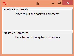
Tkinter LabelFrameThe LabelFrame widget is used to draw a border around its child widgets. We can also display the title for the LabelFrame widget. It acts like a container which can be used to group the number of interrelated widgets such as Radiobuttons. This widget is a variant of the Frame widget which has all the features of a frame. It also can display a label. The syntax to use the LabelFrame widget is given below. SyntaxA list of options is given below. | SN | Option | Description |
|---|
| 1 | bg | The background color of the widget. | | 2 | bd | It represents the size of the border shown around the indicator. The default is 2 pixels. | | 3 | Class | The default value of the class is LabelFrame. | | 4 | colormap | This option is used to specify which colomap is to be used for this widget. By colormap, we mean the 256 colors that are used to form the graphics. With this option, we can reuse the colormap of another window on this widget. | | 5 | container | If this is set to true, the LabelFrame becomes the container widget. The default value is false. | | 6 | cursor | It can be set to a cursor type, i.e. arrow, dot, etc. the mouse pointer is changed to the cursor type when it is over the widget. | | 7 | fg | It represents the foreground color of the widget. | | 8 | font | It represents the font type of the widget text. | | 9 | height | It represents the height of the widget. | | 10 | labelAnchor | It represents the exact position of the text within the widget. The default is NW(north-west) | | 11 | labelwidget | It represents the widget to be used for the label. The frame uses the text for the label if no value specified. | | 12 | highlightbackground | The color of the focus highlight border when the widget doesn't have the focus. | | 13 | highlightcolor | The color of the focus highlight when the widget has the focus. | | 14 | highlightthickness | The width of the focus highlight border. | | 15 | padx | The horizontal padding of the widget. | | 16 | pady | The vertical padding of the widget. | | 17 | relief | It represents the border style. The default value is GROOVE. | | 18 | text | It represents the string containing the label text. | | 19 | width | It represents the width of the frame. |
ExampleOutput: 
|


