Plot Correlation Matrix in PythonGiven two variables, if the value of one variable is dependent on the value of the other variables, we say the variables are related. The measure of the relationship between two variables statistically is called "Correlation". Here the two variables dependent on each other are the price and Demand of a product. For a general example, whenever a product starts losing its Demand, the company decreases the price of the product because, with the price decrease, Demand rises. Given a vast amount of observed data, it is hard to determine how closely two variables are related. It is a major need for data science and data analysis. Statistical techniques are used to organize all the data to get the correlation view, and for that, graphs and other representations are made. This tutorial deals with how to plot the data and make a correlation matrix in Python. Between any two variables, three types of correlations can exist: - Positive Correlation
- Negative Correlation
- Zero Correlation
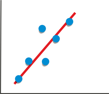
- Suppose the increase or decrease of the value of a variable leads to an increase or decrease of the other variable simultaneously. In that case, the relation between the two variables is called "Positive correlation".
- An example of a positive correlation is Demand and Profit because the increase in Demand increases the profit from the product to the company.
- With the given correlated observed values of the two variables, if the number is greater than 0 or nearer to 1, it means that a "Positive correlation" exists between the variables.
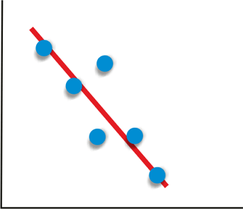
 - Suppose the increase or decrease of the value of a variable leads to a decrease or increase of the other variable simultaneously. In that case, the relation between the two variables is called "Negative correlation".
- An example of a negative correlation is Demand and price because the product's decrease in price increases its Demand.
- If the correlation number is less than 0 or nearer to negative 1, the two variables are said to be in "Negative correlation".
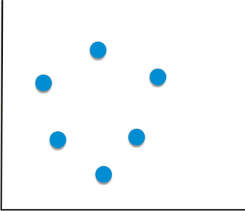
 - If two variables don't seem to be linked in any way- independent variables, then there is no correlation between them to measure, which is called "Zero correlation".
- An example of zero correlation can be the chocolate you eat and the subject you love.
- If the correlation number between the two variables is equal to 0, the two variables are in no way related to each other, hence "Zero Correlation".
 - The libraries needed:
- Sklearn
- Numpy
- Matplotlib
- Pandas
Given data about two variables, we can find the correlation between the two variables using Pandas: Output: 0.9793792286287205
0.9793792286287205
- If two variables are in correlation, the first variable is dependent on the second variable just as much as the second variable is dependent on the first. Hence, the two values are the same.
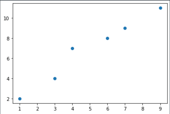
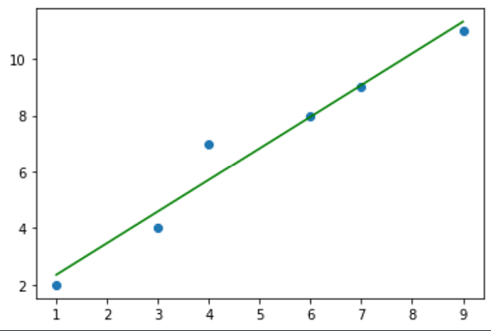
Now, given the data about the two variables, we can plot a graph showing the correlation we can achieve using the functions in the libraries mentioned above. If the libraries are not installed, we can install them using pip or conda manager. - To plot the data, we need to import the pyplot module of the matplotlib library.
Code:Output: 
 - A scatter plot is a graph in which every value in the data is plotted as a dot and shows the relationship between the two variables.
- Click on the plot section to see the plots.
Functions used: - Series (): It represents the array of values of the variable.
- polyfit (): It returns the coefficients of the polynomial formed by the data set of the two variables.
- poly1d (): It is used to define a polynomial function to apply mathematical operations on the polynomial.
- unique (): it is used to eliminate duplicate values from the data sets, which are useless for finding the correlation.
- plot (): It is used to plot the points of the datasets of the two variables.
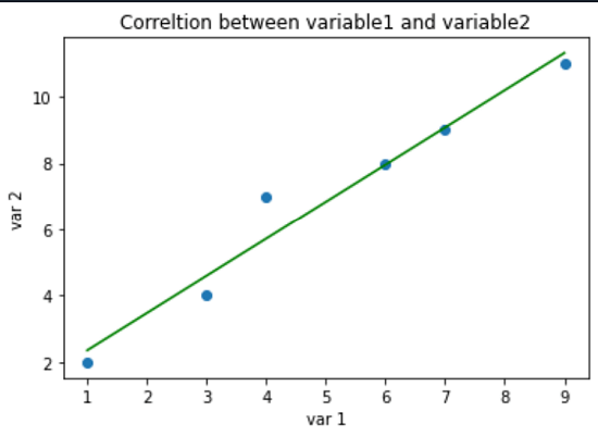
Customizing the Plot: We can add a title and labels to make the plot more understandable. For this, we can use the title () and label () functions: Output:  Functions used: - title: It is a function in matplotlib to title the visualization created, in this case, the graph
- xlabel, pyplot. ylabel: These two functions are used to name the axis with what its values represent.
Data Frames from Sklearn Library:Sklearn is a machine learning library in Python. It has seven built sample datasets in it, which the programmer can use without the need to download any external file. - The seven datasets are called "Toy datasets", and we'll use one of those seven datasets and plot a correlation matrix for that dataset.
Dataset: sklearn. load_iris () Code: Output: Sepal length (cm) sepal width (cm) ... petal width (cm) relation
0 5.1 3.5 ... 0.2 0
1 4.9 3.0 ... 0.2 0
2 4.7 3.2 ... 0.2 0
3 4.6 3.1 ... 0.2 0
4 5.0 3.6 ... 0.2 0
.. ... ... ... ... ...
145 6.7 3.0 ... 2.3 2
146 6.3 2.5 ... 1.9 2
147 6.5 3.0 ... 2.0 2
148 6.2 3.4 ... 2.3 2
149 5.9 3.0 ... 1.8 2
[150 rows x 5 columns]
We created a data frame from pandas and included the iris data set. Out of the four features in the data set, we'll try to find the correlation between Sepal length and petal width: - To find the correlation between these two variables, as mentioned above, corr() method is used:
Code: Output: The correlation number between Sepal length and Petal length: 0.8179411262715757
- The correlation number is nearer to 1; hence Sepal length and petal width are in Positive correlation.
Correlation matrix: Code: Output:  - Previously, we found a correlation between two variables. Here, using the dataframe. corr () method, we created a correlation matrix with all the correlation numbers.
- We used the background gradient to colour the correlation matrix to see how each value is correlated.
- The dark colour shows the highly correlated values.
- Light colour shows the values that have less correlation. Here:
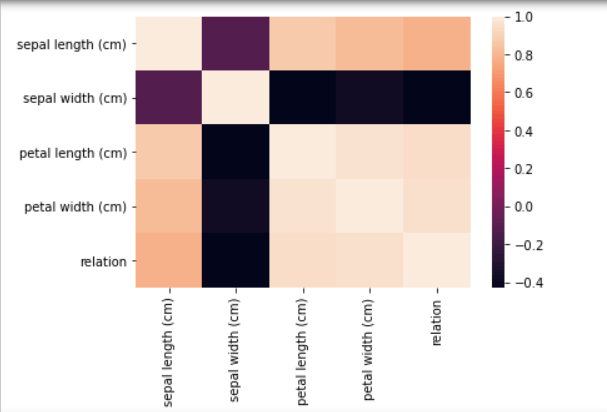
Correlation HeatMap: A HeatMap is another efficient way of plotting a correlation matrix. It shows the correlation of a pair of every two variables. It belongs to the Seaborn library. Code: Output:  Understanding: - Like applying background gradient to the correlation matrix, a heatmap is also analyzed using colours.
- Reddish or brighter colours represent highly correlated values, and lighter colours are used to represent less common values.
- It shows how a variable correlates with all the other variables pairwise, thus giving a clearer analysis of the related data.
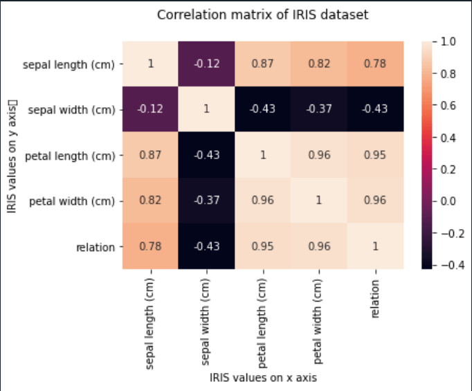
Customizing the heatmap: Using the pyplot module of the matplotlib library, we can add titles and labels on x and axes to the matrix, thus making it more understandable. - In the seaborn. heatmap (), by specifying annot = True, the matrix shows the correlation numbers.
Code: Output:  - As discussed above, positive values nearer to 1 represent "Positive correlation", and negative values represent "Negative correlation".
- This heatmap can be saved as a png file using the savefig () method.
Conclusion:Correlation specifies the measure of relation/ dependence of one variable on another variable. It is simple to calculate using statistical techniques. But, when it comes to large amounts of data, it is hard to analyze the relation. Hence, we use correlation matrices in which the colours of the plots help the programmer differentiate and understand the correlation between the variables. This tutorial discusses how to analyze a correlated matrix using: - Background gradient
- Heatmaps
|
