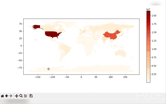
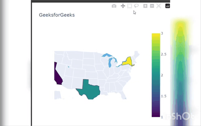
How to Re-size Choropleth maps - PythonGeospatial data can be effectively visualised using choropleth maps. These maps enable you to rapidly spot patterns and trends by using various shades or colours to represent various values or categories of data for various places. The default choropleth map sizes, nevertheless, might not always be the best option for your specific use case. In this article, we'll look at how to use Python to enlarge choropleth maps. A sort of themed map known as a choropleth shows split sections or territories that have been shaded or patterned in accordance with a particular data variable. Choropleth maps can be produced in Python using a variety of tools, including matplotlib, plotly, and geopandas. A strong tool for displaying data over a specific geographic area is a choropleth map. The two most popular libraries for generating choropleth maps in Python are geopandas and plotly. The plotly or matplotlib layout() function can be used to change the size of choropleth maps in Python. In order to visualise and analyse spatial patterns and trends in data, choropleth maps are frequently used in a variety of disciplines, including geography, economics, and public health. Here, we'll go through three techniques for producing resizable maps. Prerequisites Using the pip command shown below, install the necessary libraries. Choropleth map using the GeoPandas library.In the following example, we begin by loading the needed libraries, geopandas and matplotlib. After loading the naturalearth_lowres dataset, we plot the gdp_md_est column, which denotes the estimated gross domestic product, to produce a choropleth map of the nations. We employ a legend and the OrRd colour map. The plot is then resized by obtaining the current figure object with plt.gcf(), altering its size with set_size_inches(), and showing the plot with plt.show(). We chose a figure size of 12 inches wide by 6 inches tall for this instance. We can modify the size to meet your precise requirements. By using the components that are visible in the output, we can resize that map. Output:  Choropleth map using the Plotly library.In this, we import the Plotly library. This code uses the plotly.graph_objects module to create a Choropleth map of the United States, displaying data for three states (California, Texas, and New York) with corresponding values (1, 2, and 3) represented by color. we can resize that map using the components which are showing in the output. Output:  Another technique to create a choropleth map is to change the colorbar's size, which is the legend that displays the range of values the map's colours stand for. Using the coloraxis parameter, Plotly lets you change the size and placement of the colorbar. In the example above, the coloraxis_colorbar parameter is updated to a dictionary using the update_layout method, with the entries thickness, len, yanchor, and y standing in for the colorbar's thickness, length, vertical anchor, and position, respectively. We make the colorbar broader and shorter by setting the thickness to 20 and the len to 0.5. The colorbar is positioned vertically in the middle of the plot by setting the yanchor to "middle" and the y value to 0.5. By utilising the zoom option to increase or decrease the zoom level, you may also change the map's actual size. You can select the zoom level of the map using this option, where higher values indicate a closer view and lower values indicate a farther view. In this example, the geo parameter is set to a dictionary with the keys scope and projection_scale, which stand for the geographic scope of the map and the scale of the projection, respectively, using the update_layout method. We enlarge and zoom in on the US map by changing the projection_scale to 2 and the scope to 'usa'. Next TopicStruct Module in Python |

We provides tutorials and interview questions of all technology like java tutorial, android, java frameworks
G-13, 2nd Floor, Sec-3, Noida, UP, 201301, India


